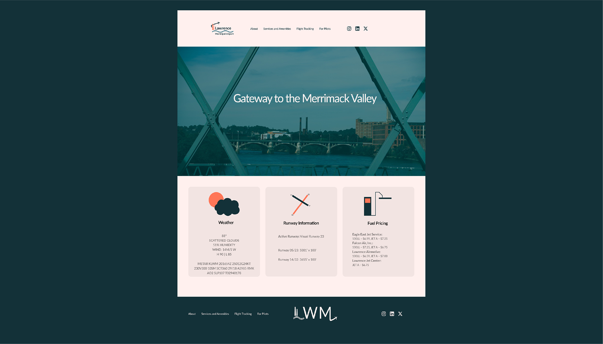
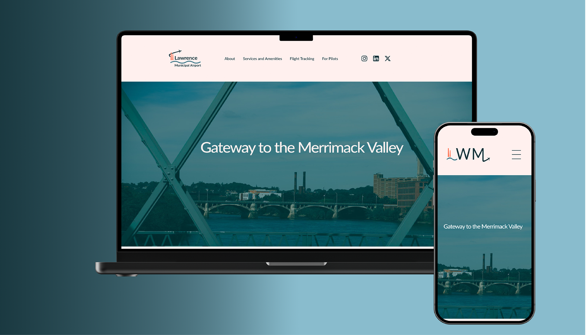
Lawrence Municipal Airport (LWM) Concept Rebrand
Situated in the heart of the Merrimack Valley in Massachusetts, LWM has served as a regional gateway since 1934. This rebrand concept seeks to create a modern identity for the airport: elevating its position as a hub for business, corporate, and charter aviation, while staying true to the region's industrial roots.
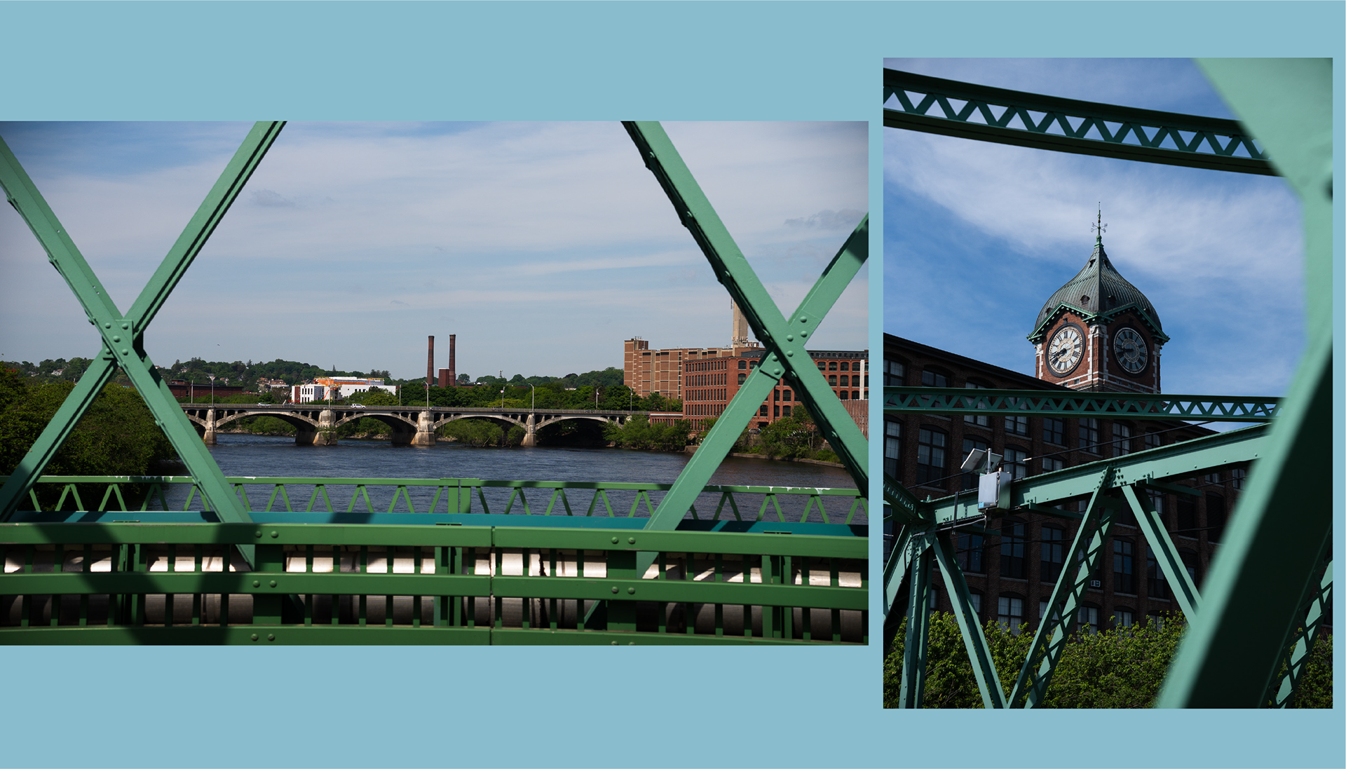
I took reference photos around Lawrence for inspiration for the logos and to use as the main hero image on the website mockup.
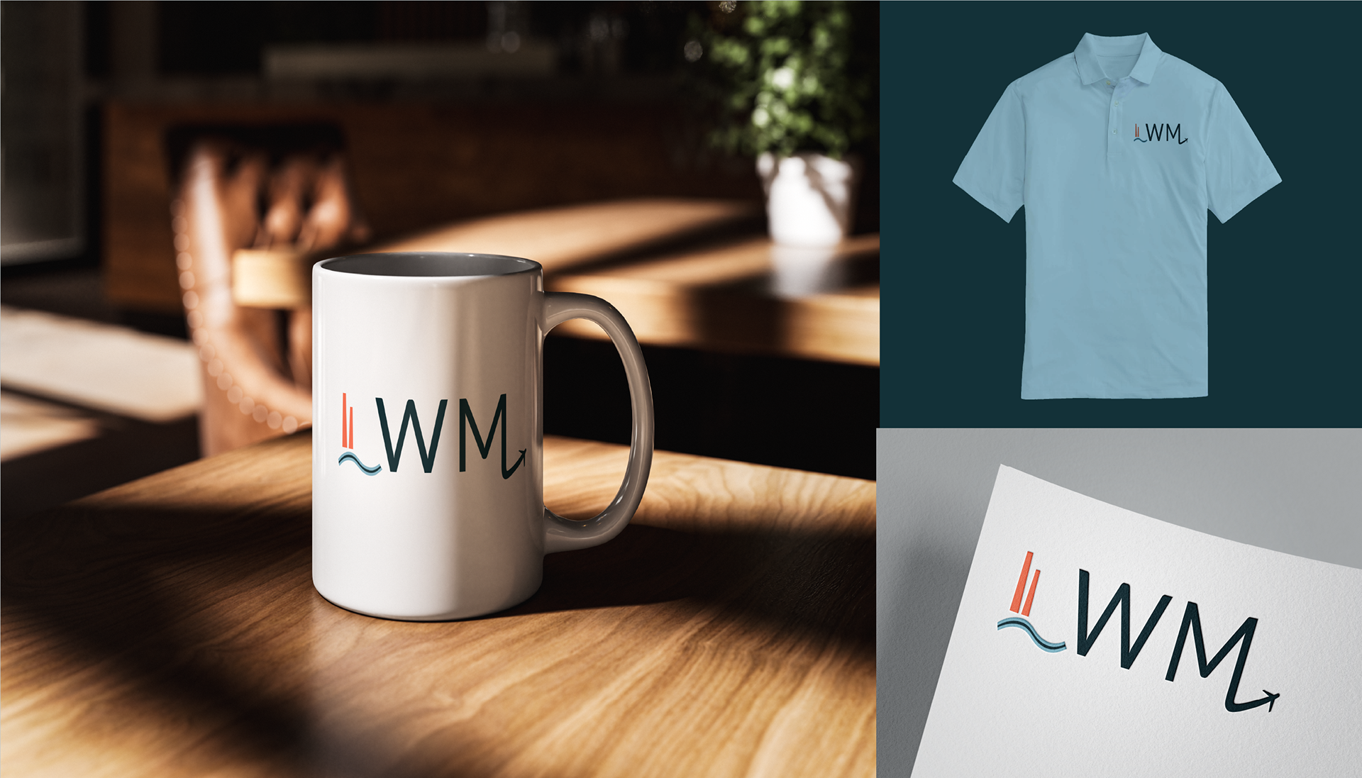
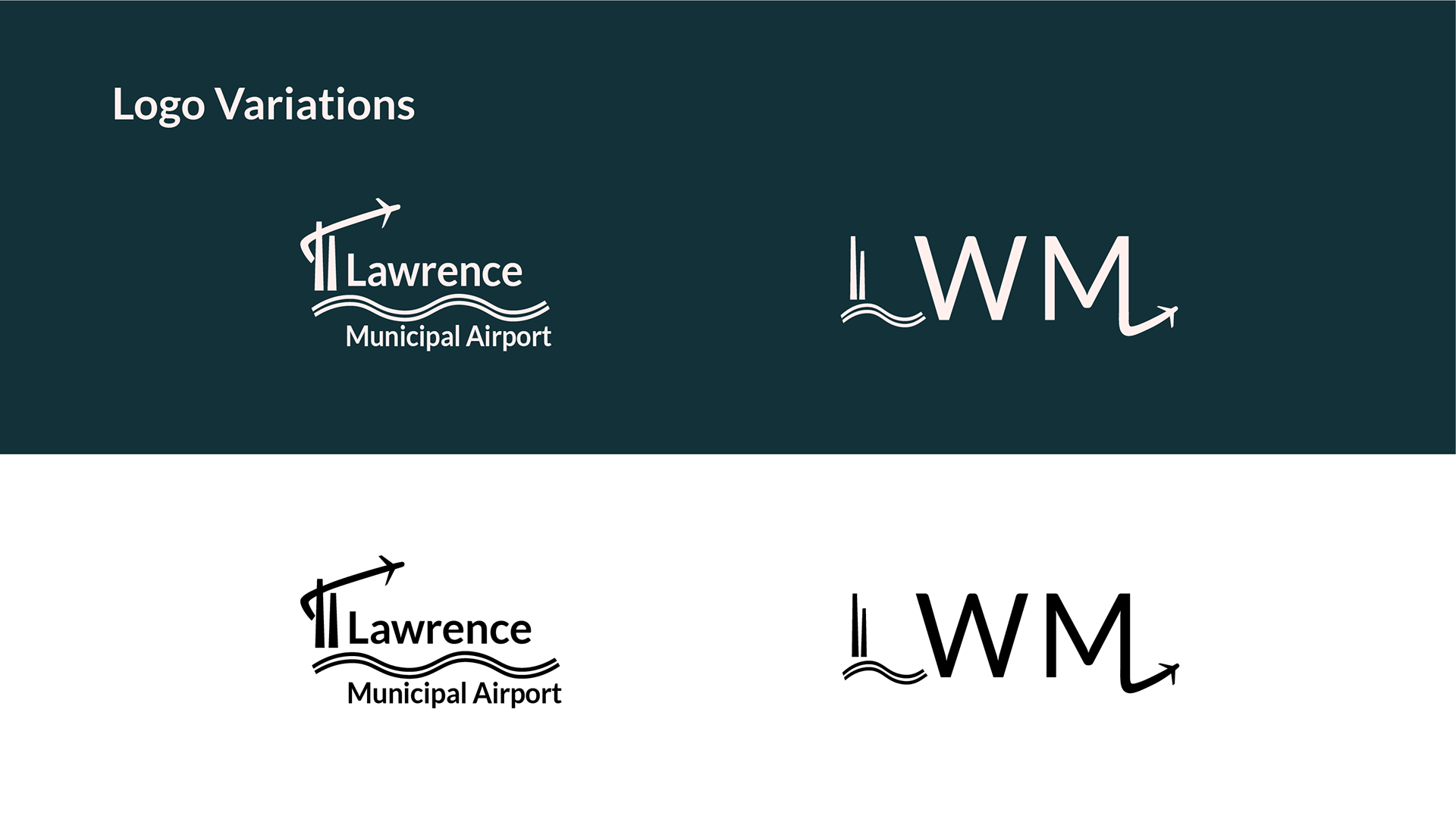
To capture the industrial spirit of Lawrence, the logos feature two primary motifs: factory smokestacks and the Merrimack River. Both motifs also come together to form the "L" in the LWM lettermark logo.
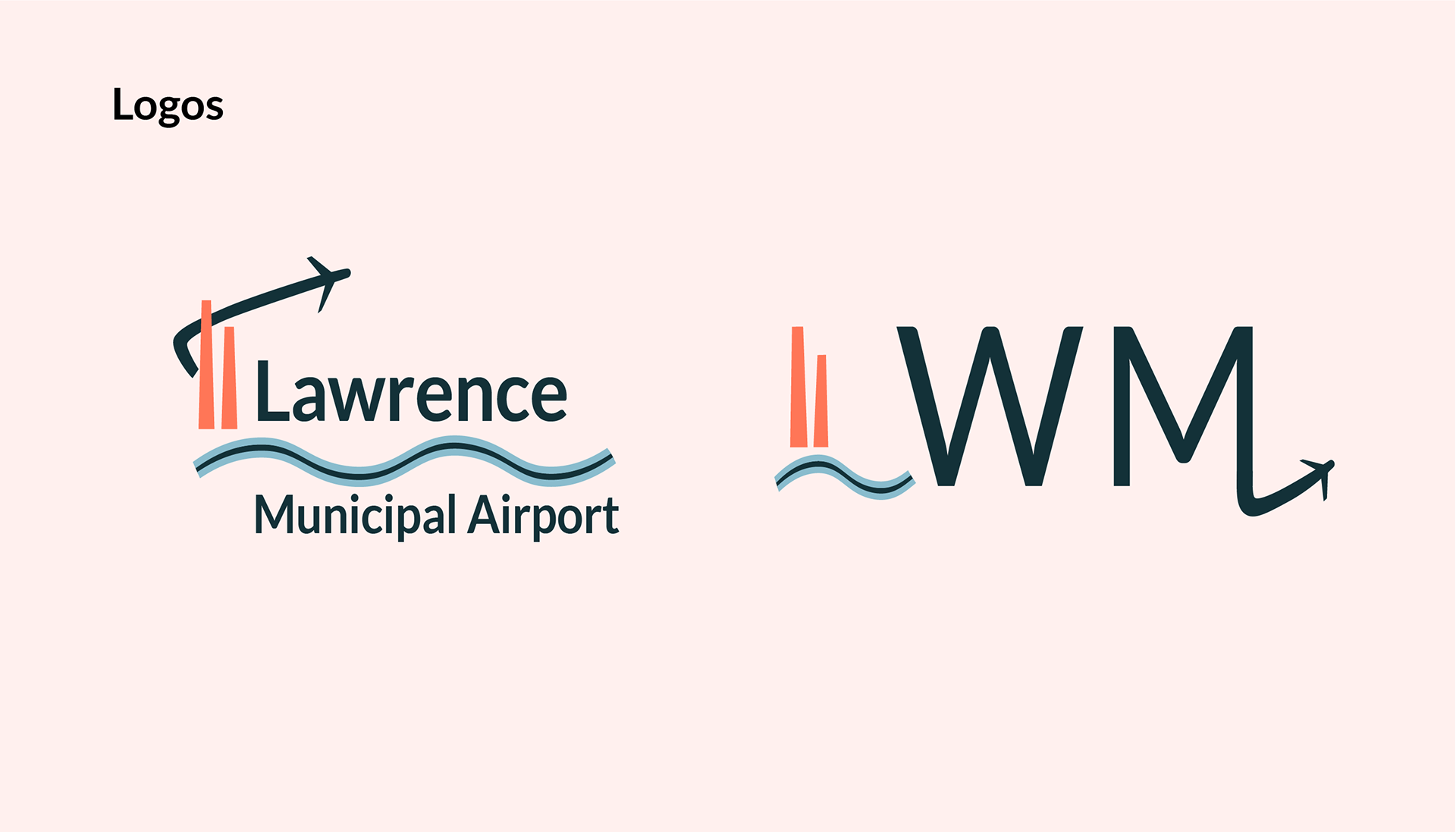
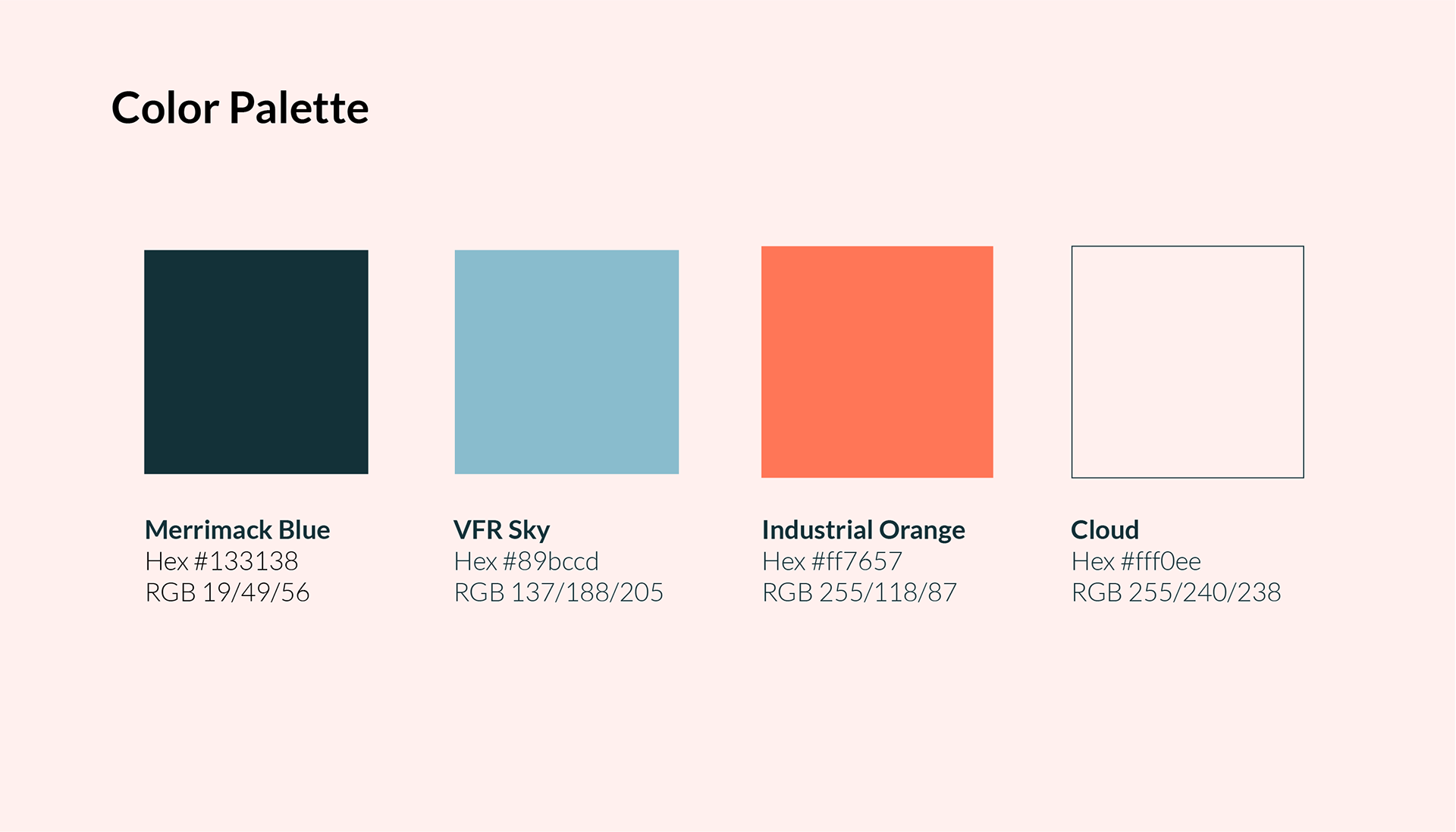
Three primary colors form the logo: a dark blue reminiscent of the Merrimack river, a bright sky blue to represent clear Visual Flight Rules (VFR) condition skies, and a bright orange accent color to represent the industrial facades found around Lawrence and the surrounding cities in the Merrimack Valley. A fourth off-white color was chosen to provide a neutral, easy on the eyes canvas when viewing the desktop or mobile site.