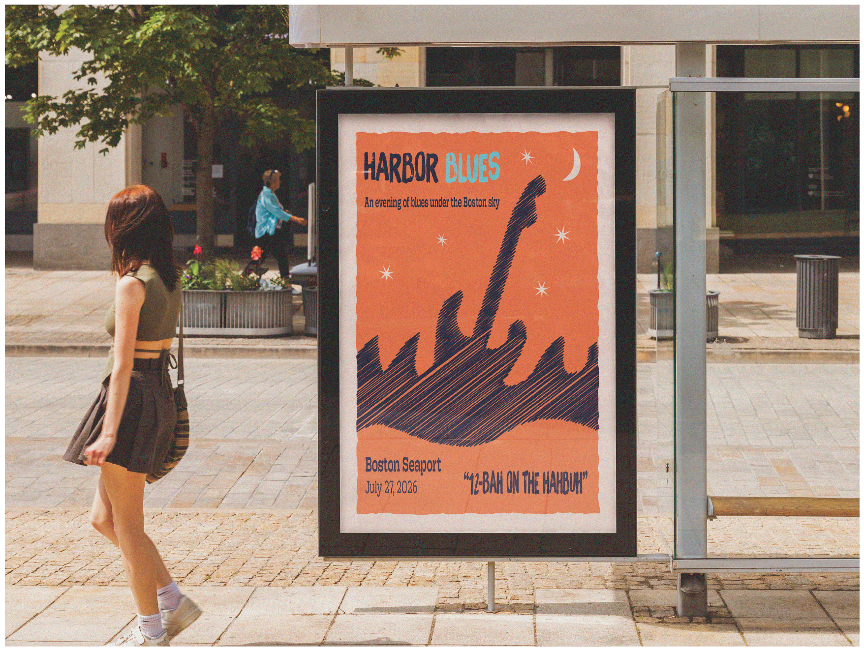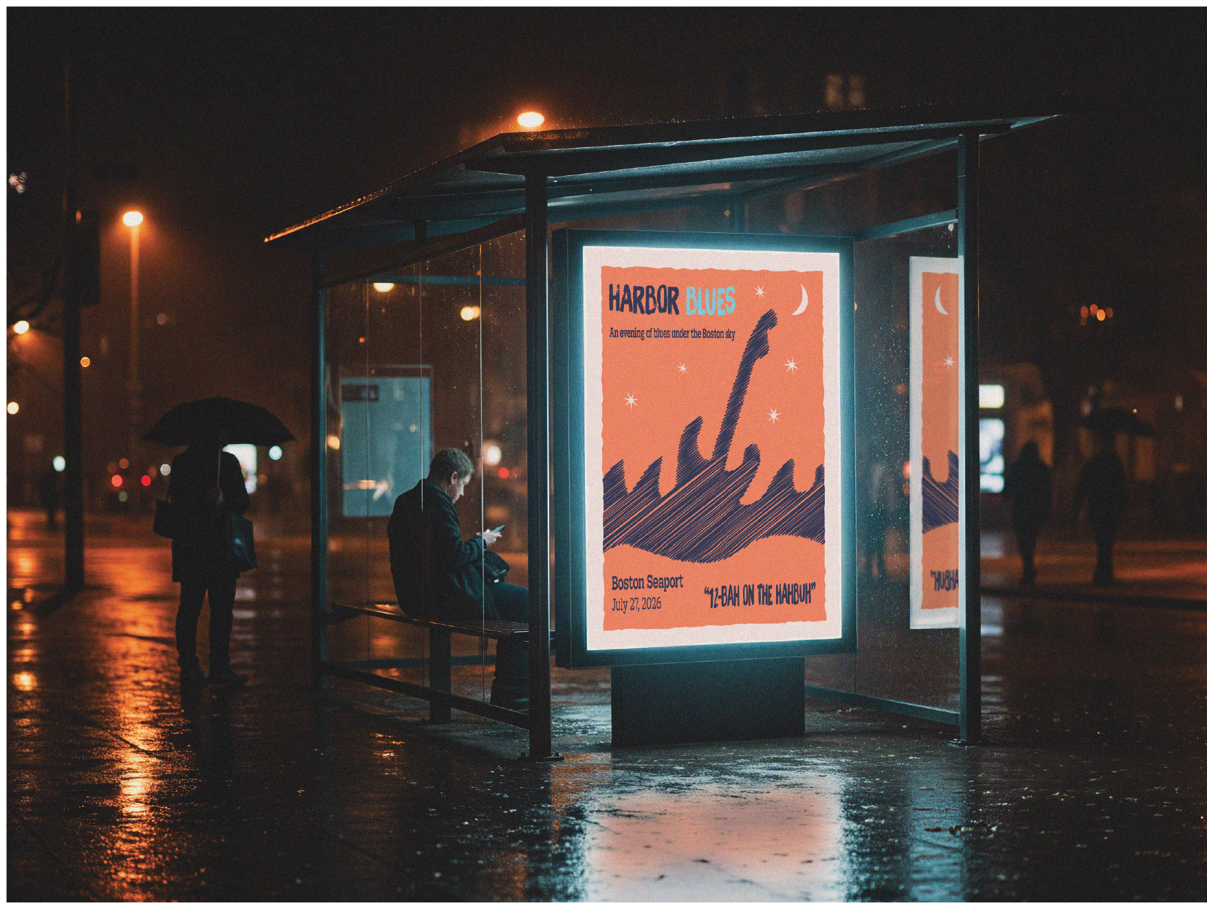
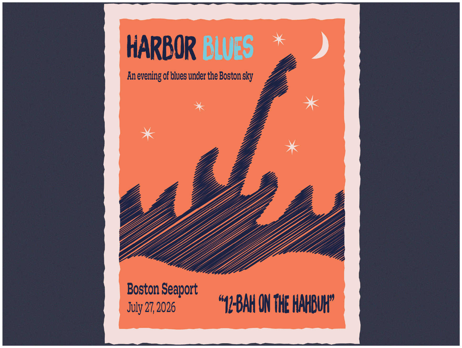
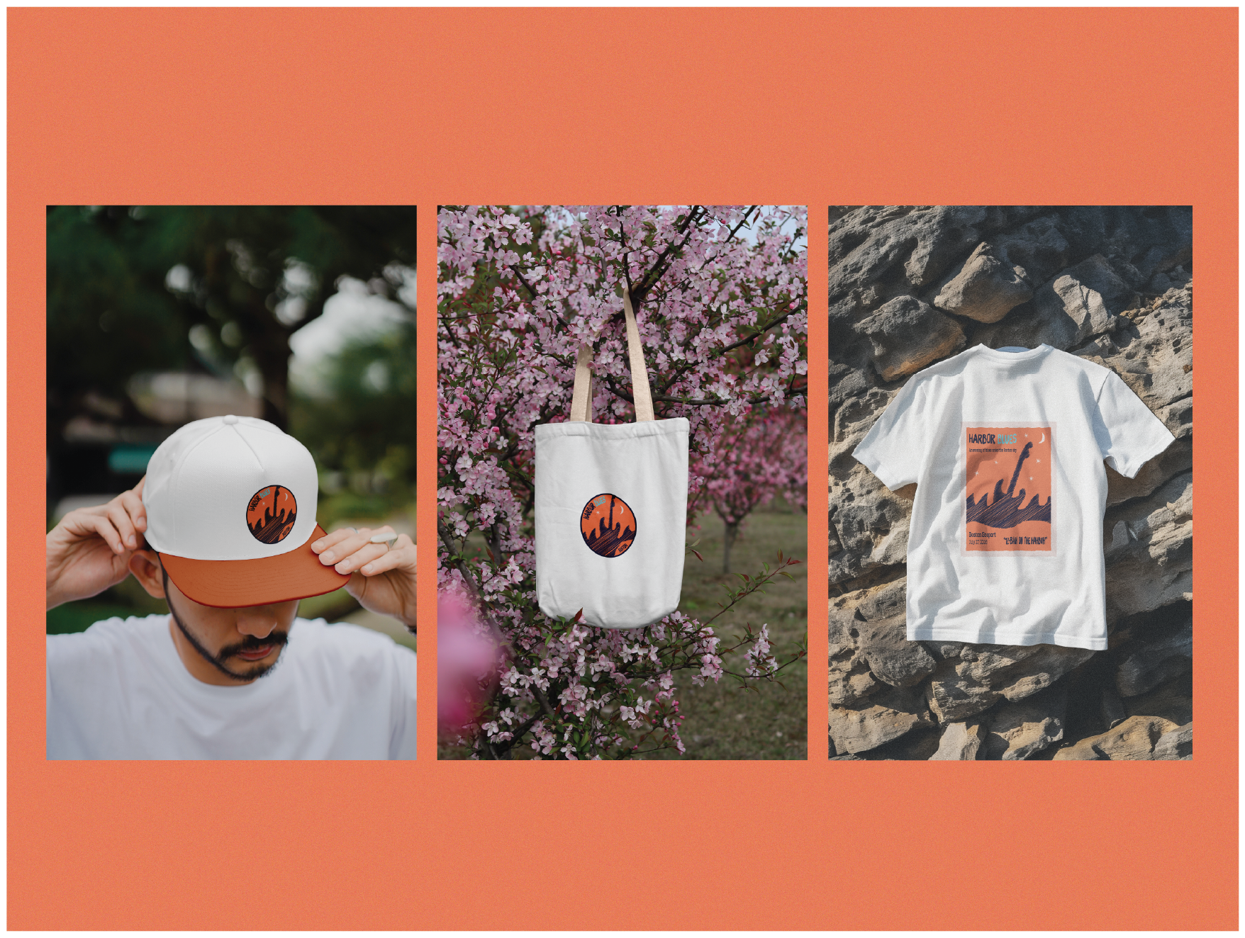
My goal for this project was to create a poster for a blues music festival in Boston's Seaport, along with an accompanying logo suite and merchandise spread for the show.
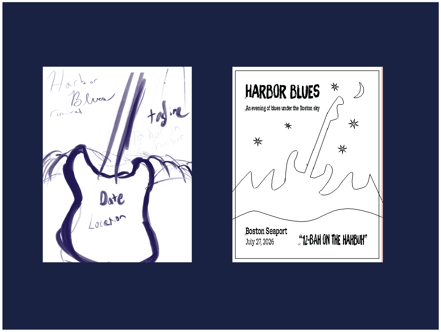
The overall mood for the poster is intended to be warm, inviting, and vintage-inspired with a worn, hand-drawn feel. The main illustration features an outline of a Fender Stratocaster guitar, with the guitar body's "horns" reminiscent of rolling waves. As this is a concert along the waterfront, the outline of the guitar's body seamlessly blends with a wave-like illustration to fit the concert setting.
A lighthearted, Boston-centric tagline of "12-bah on the hahbuh" (translation, 12-bar blues on the harbor) sits in the lower right corner for some added personality and memorability.
From initial, crude Procreate sketch through design process. The original thought was to put the guitar in the forefront, with waves in the background rolling along the guitar body, but as the design progressed, combining the waves with the guitar into one seamless silhouette made for a more striking final design.
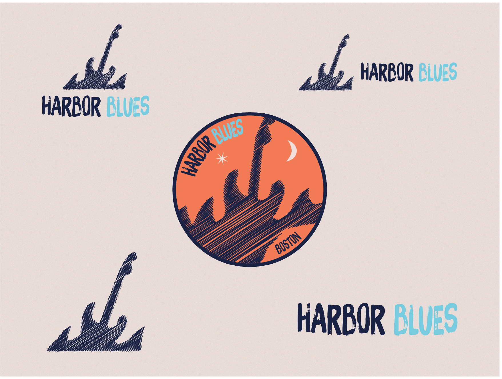
A comprehensive logo suite using imagery from the poster parsed down into its main elements: the guitar & wave silhouette and the Harbor Blues display text.
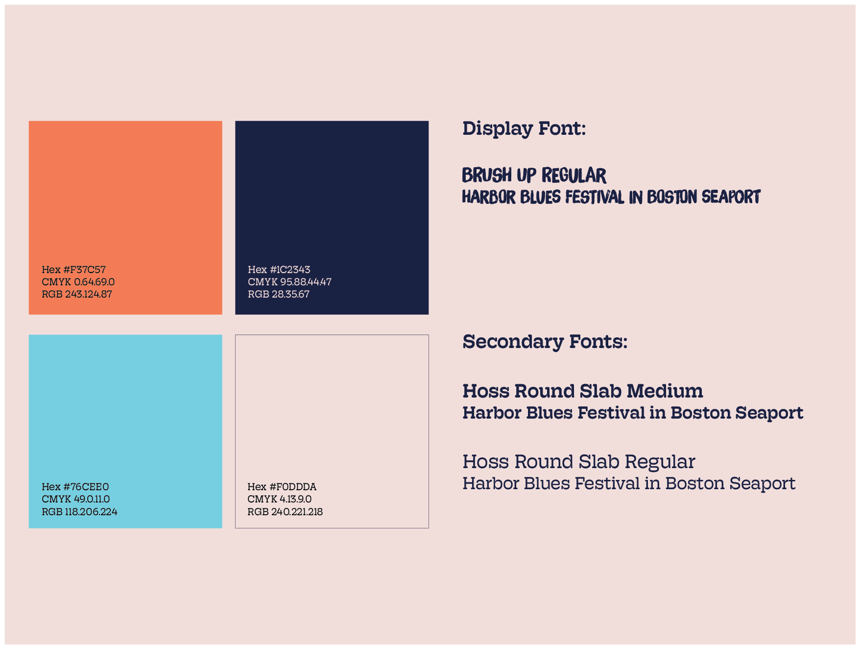
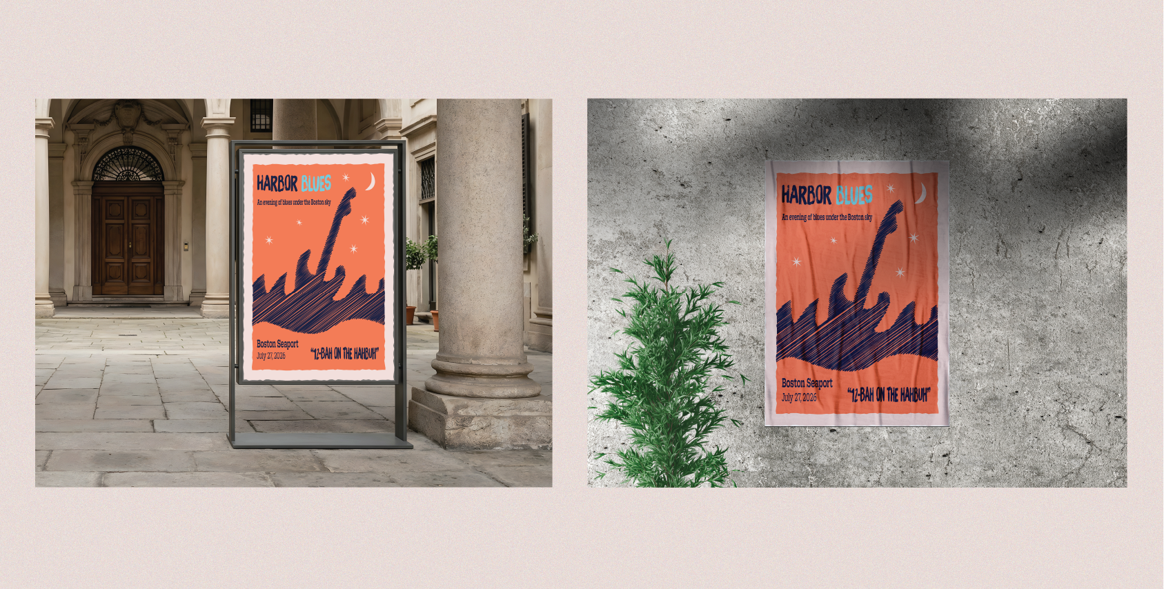
Color-wise, one primary dark blue is mainly used throughout the poster, along with a lighter blue accent color in the festival name for some more pop. These blues are paired with an orange background, reminiscent of an evening sky. A cream color caps things off with the accents of the stars, moon, and surrounding frame of the poster.
For type, I chose Brush Up as a main, eye-catching display font for the Harbor Blues moniker. This font matches the hand-drawn, inviting feel that I was seeking.
This display font is paired with Hoss Round Slab, chosen for its overall legibility and friendly feel.